Use with React
This page describes why Styletron is a great fit for React. It also goes over some APIs that styletron-react provides and pitfalls that you can run into. If you are trying to set up Styletron for your project, please check the Getting Started page first!
- Motivation
- Styled Components
- Props Filtering
$asprop$styleprop- useStyletron Hook
- Refs
- Composing Styles
- displayName
- Themes
- Testing
- Debugging
Motivation
React components are independent and reusable pieces of UI. They accept props and return a description of what should appear on the screen - typically, in the form of HTML markup. For long time, the styles were left outside of React components and handled by different means. You probably wrote or saw this code before:
function App () {
  const [isActive, setIsActive] = useState(false);
  return (
    <button
      className={`btn ${isActive ? "btn-active" : ""}`}
      onClick={() => {
        setIsActive(!isActive);
      }}
    >
      It is {isActive ? "on" : "off"}!
    </button>
  )
}
It is pretty clear that MyApp renders a button that can be in active or inactive state. What's not clear is the button's appearance. It applies .btn and .btn-active CSS classes but we don't know where those classes are defined, what rules they contain and what the overall import/build process is. Suddenly, our encapsulated piece of UI heavily relies on a code that lives outside of it. Our component lost its independence and isolation. We can't just simply copy & paste it into a different project and expect it to work. It's not portable anymore.
To make it even more awkward, the component state should directly control the button's appearance or what CSS rules are applied. When the button is active, its background should be blue. We have to toggle class names and glue together the className prop. It gets even less readable if there are multiple states.
className={`btn ${isActive ? "btn-active" : ""}`}
We call this concept dynamic styling. It happens when we need to map props and state directly into the resulting styles. This is difficult with classic CSS since you cannot easily pass variables from JavaScript to CSS.
Side note: CSS modules partly addresses some of these concerns but requires extra tooling and does not lead to portable code.
Things are looking grim so far. What if I told you we can solve enable dynamic styling and support portability by using inline styles?
function App () {
  const [isActive, setIsActive] = useState(false);
  return (
     <button
        style={{
          padding: "0.5em 1em",
          color: isActive ? "#fff" : "#000",
          background: isActive ? "#276ef1" : "none",
          fontSize: "1em",
          borderRadius: "4px",
          border: "1px solid #aaa"
        }}
        onClick={() => {
          setIsActive(!isActive);
        }}
    >
      It is {isActive ? "on" : "off"}!
    </button>
  )
}
All styles are now encapsulated in the component. We can clearly see what rules are being used. We don't have to worry about a special build process. Oh, and no className manipulation either - we don't even have classNames now! But, inline styles have some very serious limitations: For example, you can't use pseudo selectors like :hover or media queries.
If there was only a way how to get the best of both worlds. 🤔
… *drum roll* … introducing
Styled Components
Styletron provides APIs and developer experience similar to inline styles but without any drawbacks. Let's repeat the button example again but this time with Styletron:
import { styled } from "styletron-react";

function App () {
  const Button = styled("button", props => ({
    padding: "0.5em 1em",
    color: props.$isActive ? "#fff" : "#000",
    background: props.$isActive ? "#276ef1" : "none",
    fontSize: "1em",
    borderRadius: "4px",
    border: "1px solid #aaa",
    ":hover": {
      background: props.$isActive ? "green" : "yellow"
    }
  }));
  const [isActive, setIsActive] = useState(false);
  return (
    <Button
      $isActive={isActive}
      onClick={() => {
        setIsActive(!isActive);
      }}
    >
      It is {isActive ? "on" : "off"}!
    </Button>
  )
}
It looks somewhat similar to the inline style example. The styles are still defined inside of the component; however, this time we create a styled component with the styled function.
The styled function expects two arguments:
- Element type - What underlying DOM element should be used. In our case, we chose
button. - Style function / object - To describe the styles. It can be a plain style object or a function that returns a style object. The function gets
props. That's useful if your styles need to be dynamic (derived fromprops).
Styletron supports hooks too for styling - you can skip to the useStyletron section here.
For styling properties, we use camelCase and there are some other subtle differences described in Concepts. We can also now use pseudo classes as :hover. The inline styles limitations don't apply anymore!
Once the styled component is created, we can render it as any other React component. We don't need to set style or className prop. The styled component already does that for us on the background - Styletron creates a bunch of CSS classes and "glues" them to the <button /> element. Check the Home page example for more details.
One thing that might seem a bit off is the $isActive prop. Why do we use $ when we could simply call it isActive instead?
Props Filtering
Note that we are passing two props into our styled Button component
<Button $isActive={/*…*/} onClick={/*…*/}>…</Button>
and they have very different purposes:
$isActiveis used to create the style objectonClickis an event handler that needs to be passed to the underlyingbuttonelement, we don't use it for styling purposes at all
The problem is Styletron doesn't see the difference. It doesn't know what props should or shouldn't be passed all the way down to the underlying element. What happens when all props are blindly passed to the DOM element?
Warning: React does not recognize the
$isActiveprop on a DOM element. If you intentionally want it to appear in the DOM as a custom attribute, spell it as lowercase$isactiveinstead. If you accidentally passed it from a parent component, remove it from the DOM element.
So you need to help Styletron a bit. All props starting with $ are filtered out and not passed to the underlying element. That's the only and whole purpose of $.
Styletron could whitelist all DOM attributes and filter out other props but that's considered as an anti-pattern. Mostly, because it would make the bundle bigger and it's bad for performance.
The warning message above was manufactured since $isActive is filtered out by Styletron. However, if you renamed it to isActive you would see it!
$as prop
$as has a special meaning. It allows you to swap the underlying element:
() => {
  const Text = styled("p", { color: "red" });
  return (
    <>
      <Text>Rendered as a paragraph</Text>
      <Text $as="button">Rendered as a button</Text>
    </>
  );
};
Rendered as a paragraph
This can be especially useful when you need to swap between a and button or h1, h2, h3. You don't need to create multiple styled components for that.
$style prop
The $style property allows you to override styles directly on a styled component.
For example, we have some boring gray text.
Let's make it beautiful by passing a $style override:
() => {
  const BoringText = styled("div", { color: "gray" });

  return (
    <>
      <BoringText $style={{ color: "hotpink" }}>pretty in pink</BoringText>
    </>
  );
};
You can also pass $style a function for dynamic overriding based on props:
() => {
  const BoringText = styled("div", { color: "gray" });

  return (
    <>
      <BoringText
        $style={props => ({ color: props.$special ? "hotpink" : "gray" })}
        $special
      >
        pink panther
      </BoringText>
    </>
  );
};
$style also takes precendence over withStyle:
() => {
  const BoringText = styled("div", { color: "gray" });
  const MostBoringText = withStyle(BoringText, { color: "dimgray" });

  return (
    <>
      <MostBoringText $style={{ color: "hotpink" }}>
        on wednesdays we wear pink
      </MostBoringText>
    </>
  );
};
useStyletron Hook
🎉 New in v5, Styletron's first React Hook!
useStyletron introduces a lightweight approach to generating CSS classes for an element or component, without having to opt in to the standard Styletron styled component API.
This allows you to style any element or component directly while still taking advantage of Styletron's efficient CSS generation.
import { useStyletron } from "styletron-react";

export default () => {
  const [css] = useStyletron();
  return (
    <>
      <button className={css({ color: "red" })}>Red Button</button>
      <button className={css({ color: "blue" })}>Blue Button</button>
    </>
  );
};
The css function returned by useStyletron returns a string containing the CSS classes required to style the component.
We can pass this string directly to an element or component's classNames property.
Even more awesome- if you are using styletron-engine-atomic the classes returned by css will still be deduped with the rest of your Styletron atomic CSS.
You get all the benefits of inline styling without any of the negative effects-- with almost none of the overhead associated with a styled component.
Caveats
- By opting out of a styled component you do give up some useful features such as built in overriding, composability, and reusability.
- You still need to wrap your application code in a Styletron
<Provider />for theuseStyletronhook to work correctly.
Refs
When you use a ref on a styled component it will be forwarded to the underlying element.
For example, we have a styled input and a button. We want to focus the input when the button is clicked:
import { styled } from "styletron-react";

class MyApp extends React.Component {
  constructor() {
    this.inputRef = React.createRef();
  }
  render() {
    const Input = styled("input", { background: "#FFE1A5" });
    return (
      <>
        <Input ref={this.inputRef} />
        <button onClick={() => this.inputRef.current.focus()}>
          Focus input
        </button>
      </>
    );
  }
}
As expected, this.inputRef is forwarded to the underlying input.
Previous versions of Styletron required refs to be passed using a $ref property.
As of Styletron v5 this work-around is no longer neccessary (thanks to React.forwardRef).
See here for more info on React Refs.
Composing Styles
As you use Styletron you may eventually run into some fundamental questions:
- How do I tweak a few styles on a styled component?
- How do I reuse styles across multiple components?
Styletron offers a few strategies:
- Use the
$styleprop for direct component style overrides - Compose existing styled component using the
withStylefunction - Use props (
$type,$isActive, etc) to allow customization of styled components
Here are a few scenarios that map to these strategies:
Tweaks
If you only need a slight modification to an existing styled component and reuse is not a concern, look no further than the $style prop:
() => {
  const Button = styled("button", {
    color: "black",
    border: "solid 1px currentColor"
  });

  return (
    <>
      <Button>Button</Button>
      <Button $style={{ color: "red" }}>Button</Button>
    </>
  );
};
Reusing Styled Components
If you want to reuse modifications to a styled component, consider the withStyle function, which returns a new styled component:
import { withStyle, styled } from "styletron-react";

export default () => {
  const Button = styled("button", {
    color: "black",
    border: "solid 1px currentColor"
  });
  const BlueButton = withStyle(Button, { color: "blue" });

  return (
    <>
      <Button>Button</Button>
      <BlueButton>Blue Button</BlueButton>
    </>
  );
};
BlueButton overrides the color property but keeps other Button styles intact.
This is especially useful if you don't own the Button component and you can't change its API (by adding an $isBlue prop for example).
Expanding a styled component's API
withStyle is a powerful tool but you should avoid over-using it.
Oftentimes, it is better to update the original component and add some additional props to it.
For example, instead of:
const PrimaryButton = withStyle(Button, { color: "blue" });
const SecondaryButton = withStyle(Button, { color: "turquoise" });
const TertiaryButton = withStyle(Button, { color: "purple" });
it might be better to add a $type property to the Button component:
const getButtonColor = $type => {
  switch ($type) {
    case "primary":
      return "blue";
    case "secondary":
      return "turquoise";
    case "tertiary":
      return "purple";
    default:
      return "black";
  }
};
const Button = styled("button", props => ({
  color: getButtonColor(props.$type),
  border: "solid 1px currentColor"
}));

return (
  <>
    <Button $type="primary">Primary</Button>
    <Button $type="secondary">Secondary</Button>
    <Button $type="tertiary">Tertiary</Button>
  </>
);
It's more verbose but you will end up with a single component Button that doesn't rely on internal styles of some other component.
In the future, you can decide to replace color by backgroundColor and it will not break withStyled components.
displayName
The displayName string is used in debugging messages. Usually, you don’t need to set it explicitly because it’s inferred from the name of the function or class that defines the component. You might want to set it explicitly if you want to display a different name for debugging purposes or when you create a higher-order component, see Wrap the Display Name for Easy Debugging for details.
Since styled is technically a higher-order component, we need to set the displayName explicitly to see the real component name when debugging (or shallow snapshot testing). If you are tired of doing this manually, we provide babel-plugin-transform-styletron-display-name that will do this for you!
yarn add babel-plugin-transform-styletron-display-name
Add this plugin into your .babelrc:
{
  "plugins": ["babel-plugin-transform-styletron-display-name"]
}
The plugin takes this code
const Foo = styled("div", {
  color: "red"
});
and transforms it into
const Foo = styled("div", {
  color: "red"
});
Foo.displayName = "Foo";
Themes
You probably want to keep colors or sizing consistent across various components. A good practice is to keep these values defined in a single location so you can change them globally. You could create a module for this purpose:
// theme.js
const THEME = {
  colors: {
    primary: ["#276EF1", "#174EB6", "#9CBCF8"],
    positive: ["#07A35A", "#057C44", "#88D3B0"]
  },
  sizing: ["2px", "6px", "10px", "16px", "24px"]
};
export default THEME;
and then import it in your components
import { styled } from "styletron-react";
import THEME from "./theme";

export default () => {
  const Card = styled("div", {
    padding: THEME.sizing[3],
    backgroundColor: THEME.colors.positive[0]
  });
};
This works but there are some downsides:
- You have to always import the theme module
- You can't easily dynamically switch between multiple themes (imagine having some dark mode toggle in your app)
We can solve both issues by using React Context instead and creating our own enhanced styled function that will always hand over the theme to the styled function through the props argument:
import { createStyled } from "styletron-react";
import { driver, getInitialStyle } from "styletron-standard";

// code bellow would be normally module (top-level) scoped
// to keep this example editable, it's wrapped by a React
// function component
export default () => {
  const THEME = {
    colors: {
      primary: ["#276EF1", "#174EB6", "#9CBCF8"],
      positive: ["#07A35A", "#057C44", "#88D3B0"]
    },
    sizing: ["2px", "6px", "10px", "16px", "24px"]
  };

  const { Provider, Consumer } = React.createContext();

  const ThemeProvider = ({ children }) => (
    <Provider value={THEME}>{children}</Provider>
  );

  const wrapper = StyledComponent =>
    function withThemeHOC(props) {
      return (
        <Consumer>
          {theme => <StyledComponent {...props} $theme={theme} />}
        </Consumer>
      );
    };

  const styled = createStyled({ wrapper, getInitialStyle, driver });

  const Button = styled("button", ({ $theme }) => ({
    backgroundColor: $theme.colors.primary[0],
    color: "#FFF",
    fontSize: $theme.sizing[3],
    padding: $theme.sizing[1]
  }));

  return (
    <ThemeProvider>
      <Button>Button</Button>
    </ThemeProvider>
  );
};
createStyled is a utility function provided by styletron-react so you can create your own styled function.
We are accessing the THEME through React Context and passing it as the $theme prop so every Styled Component (aka component using our new styled function) can use it.
Finally, we need to wrap the root of our application with ThemeProvider so the THEME constant is passed to the whole React tree. If we wanted to enable switching between multiple themes, we could place the related logic into the ThemeProvider component.
Testing
You can test styled components as any other React component.
If you want to test actual styling don't forget to wrap the tested component with Styletron's Provider!
If you do not care about styling in your test you can omit the Provider and Styletron will use a no-op fallback engine.
Just be sure to set NODE_ENV=test to prevent a whole bunch of console warnings.
Snapshot Testing
One popular approach is snapshot testing. You can emit (render) the HTML markup, save it into a file and diff it on the next run. This will prevent unwanted changes in the component's output.
To test Styletron components, please add the styletron-engine-snapshot package to your application. This package provides a deterministic engine that simply returns a JSON.stringify-ed version of the style object (with alpha-sorted keys).
yarn add --dev styletron-engine-snapshot
Once you've installed the styletron-engine-snapshot package, you can start using it in your tests - if you use Jest and react-test-renderer (Enzyme would work too!), you could do something like this:
import React from "react";
import renderer from "react-test-renderer";
import { styled, Provider } from "styletron-react";
import {StyletronSnapshotEngine} from 'styletron-engine-snapshot';

const snapshotEngine = new StyletronSnapshotEngine();

// tested component
const Button = styled("button", {
  color: "red"
});

test("Button", () => {
  const component = renderer.create(
    <Provider value={snapshotEngine}>
      <Button>Text</Button>
    </Provider>
  );
  expect(component.toJSON()).toMatchSnapshot();
});
This captures both the HTML markup and related CSS:
// Jest Snapshot v1, https://goo.gl/fbAQLP

exports[`Button 1`] = `
<button
  className="style={ color: 'red' }
"
>
  Text
</button>
`;
End-to-end Testing
The generated class names are not stable and will change often (unless the component is sandboxed as in the snapshot test above) so you should never target them. If you need a stable selector for your e2e tests, you should add data-test-id attribute.
Puppeteer is a great solution for e2e test!
Debugging
Source Maps
Generated atomic classnames can make the resulting output less readable. However, Styletron provides source maps so you can quickly jump to the source code when inspecting elements. This debugging mode needs to be enabled (default setting for Fusion, Next.js and Gatsby apps). Please follow the Getting started section for more information.

As you can see, Styletron adds an extra .__debug_x class to every element. It's only purpose is linking you to the JavaScript code that created those elements.
If you are interested how this feature works under the hood, read the Generating CSS to JS Source Maps with Web Workers and WebAssembly article.
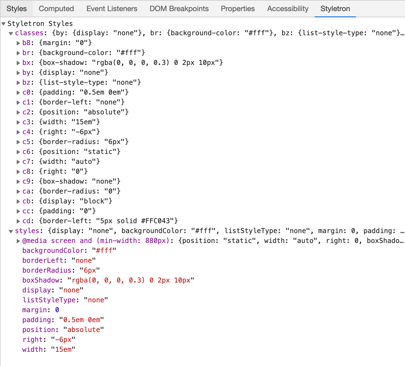
Chrome Extension
There is an another option that can make the resulting styles more readable even without using the debugging mode and source maps. Styletron offers a Chrome extension. When your app is in the dev mode (NODE_ENV=development), it adds a new panel into the devtools: